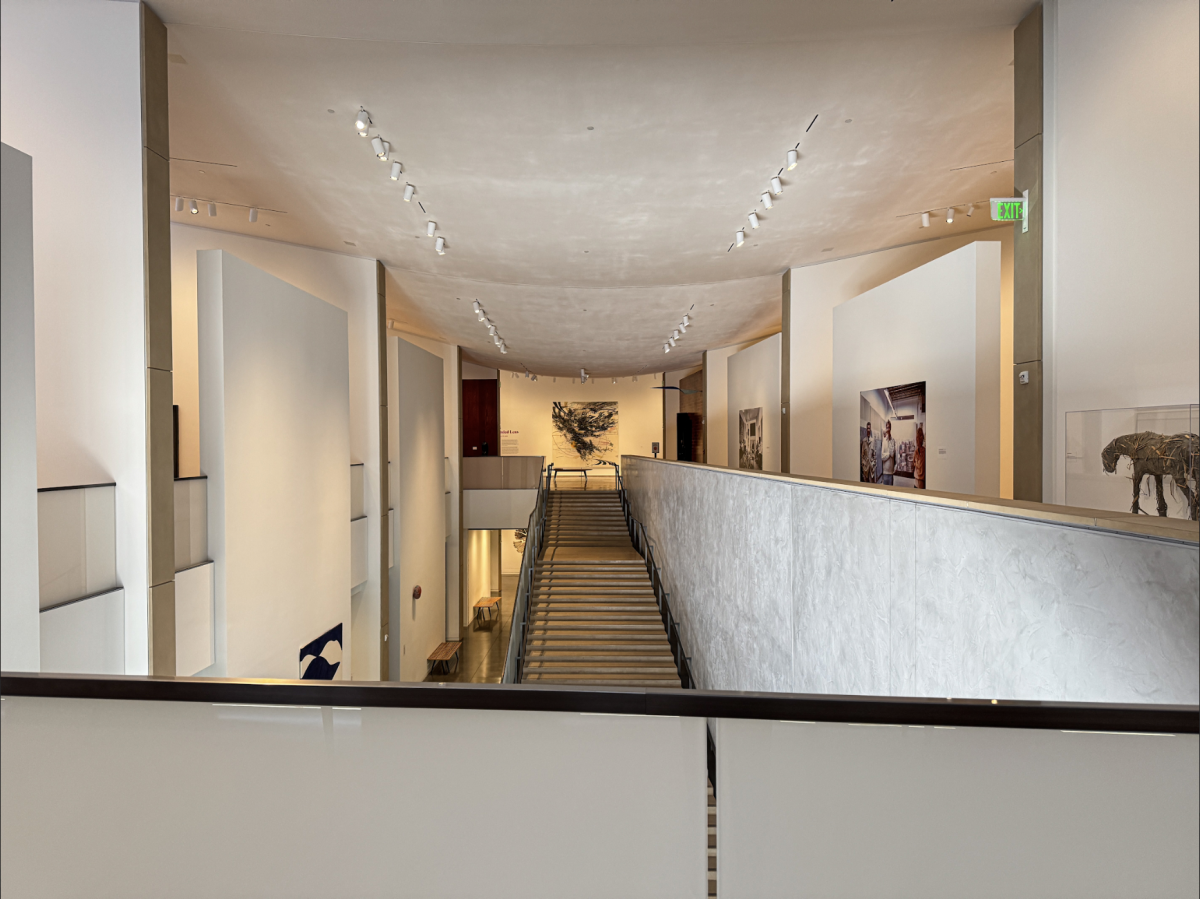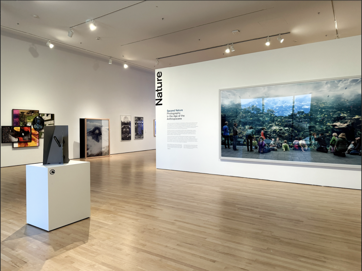


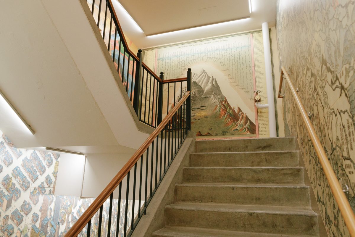
“Is it a map? Or is it art?” asks reference assistant Miles Kottler about the crystalline, infinitesimally discerning forms and lines that comprise the map collection. They vivify the space: maps spilling onto placards, gilded atlases, the large, winding stairwell. The space itself seems to breathe with their presence, as if enlivened, alive.
At the David Rumsey Map Center — a fourth-floor enclave in Stanford’s Green Library — maps, something informative and utilitarian, become art, imbued with the capacity for beauty and aesthetic value.
“Each map is a visual representation of space that shows spatial phenomena, at their very core,” head curator Evan Thornberry describes. “The map is a visual of a place or a location — that could be entirely real, or made up — but is presented in a way that emphasizes the art, the artistry. That could be the purpose: to be artistic and to kind of invoke these ideas of imagination.”
We often think of maps as functional, utilitarian illustrations, bound to the real world through depicting terrestrial space. But Thornberry and Kottler understand maps more broadly, defining them by their ability to depict any space, and spatial phenomena within it.
“I think that by having a more encompassing view of cartography, you can see how maps and arts are so woven together,” Kottler said. “It’s giving you a history. An aspect of time. It is all connected.”
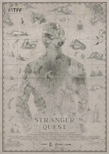
This perspective is especially relevant in the map “A Stranger Quest,” which leans much more closely toward art and departs from traditional cartographic conventions. “A Stranger Quest” is almost meta, produced in collaboration with filmmaker Andrea Gatopoulos, following David Rumsey’s own journey amassing maps, “encountering ghosts from his past, and seeing the end inching closer” (Source).
Like “conventional” art forms of painting, drawing, and sculpting, “A Stranger Quest” is visually and spatially enchanting. Its cartographic beauty is a reward in itself, so much so that its beauty almost overshadows its ostensible function. So then, is it still a map, or just art with cartographic ornamentation?
“This is a map, this is art,” reference assistant Jessie Kong said. “It’s also for a film. So, how many forms of media does this encapsulate?”
“Every map kind of proposes a version of the world, because there really is no such thing as an objective representation of space,” Kottler said. “If I made a map of the US, I couldn’t have it contain every single thing in the US — then it would be the size of the US. A map needs to reduce complexity, and in that reduction of complexity it gains meaning, but it also gains a bias. Every map abstracts reality. It’s a reduction of the world.”
Maps embed layers of meaning — cultural, political, even personal — into this compressed representation of space. This artistic reduction — what features are underrepresented or overrepresented — imparts to us the map’s angle, the cartographer’s intent, and the intention of whoever commissioned the work.
We see it in a Hungarian gastronomic map for tourists, which joyously depicts the area’s colors and foods and people without realistic geometric depth, almost cartoonishly. We see it in the map “How to Make a Golden State,” which uses an elaborate, almost palimpsestic composition to evoke the interconnectedness between Asian labor systems and the entanglement of political, environmental, and economic structures.
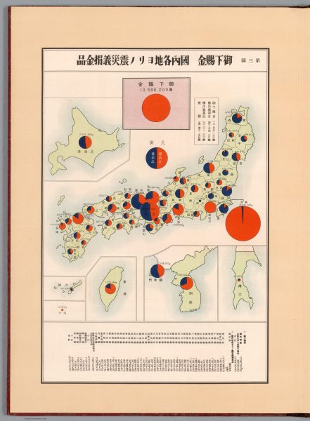
We also see it in the map center’s vast assortment of political maps that emphasize some territories but not others. A Japanese map from the 1930s, for example, traces imperial funds for earthquake and fire disaster relief to reconstruct Honshu after the Great Kanto Earthquake. Why, then, does the map elect to even show Hokkaido, Sakhalin, and then Taiwan, the Koreas? Why depict the Japanese mainlands in so much detail, but not for Taiwan and Korea, which they colonized?
A particularly fascinating globe in the collection attempts neutrality by depicting multiple contested borders (including the contentious “nine-dash line,” a mark that asserts Chinese territorial claims in the South China Sea,) spatializing the world in multiple ways to neutralize the bias and upsetting of different countries.
“The globe tried very hard to do that,” Kong said. “They drew the political borders as very, very faint dashes specifically because they wanted to show the planet in its natural landform, as opposed to humans cutting it all up. This was a handmade, hand-watercolor globe, and it also helps the watercolor shine out more without a bunch of lines breaking it up.”
Colonialism looms over many historical maps, especially in the center’s grand, gilded atlases with their opulent designs, their splendid covers and spines, that entwine cartography with imperial power.
“Just from looking at these atlases and how massive they are, it is interesting how mapping has long been a symbol of state power,” Kottler said. “Because in order to map a territory, you must have power over that territory.”
“Even the weight and the grandeur of these atlases — how grand, how beautiful some of these spines and their covers are — is an implicit display of imperial conquest,” Kong said. “And these were very much meant to look luxurious.”
You can almost feel the reverence they commanded, and the weight of the history, culture, and exclusivity imbued within these maps by looking at them. They were exclusive and luxurious. Only the rich could afford maps, and they would hang them in their houses to show how “cultured” and “worldly” they were, for the same reason we regard these maps today, because they embodied that plurality between artistic beauty and practical, commercial value.
“People were just eager to understand what the world was around them,” Thornberry said. “They had to rely on their imagination, and in order to spark that imagination, they needed those maps to show them relationships between large continents and places that they would never go to — only hear of.”
Today, digital maps have largely supplanted them, and they’re so ubiquitous that we take them for granted — “ephemeral,” as Thornberry describes, “some sort of quick and easy depiction of the earth, to sell a point in a new space.” A majority of maps have lost the cultural eliteness and “exclusiveness” that had once defined them.
It’s a loss — quite sadly so — for the artistic and tactile elements that were once so commonplace, but now feel nostalgic and “quaint,” like a relic of the past. In digital maps, there’s little trace of that humanness, that creative touch, but also little ostensible trace of bias in their sterile, forthright-looking lines.
“Google Maps almost tries to pretend that the map is objective, because everybody has Google Maps, and everybody is looking at the same map,” Kottler said. “So that in your head you think that that is ‘the map’, that is ‘the reality.’”
Kottler said of the rigidity with which digital maps often depict geographic spaces, slicing land into neat, compartmentalized sections that suggest a false sense of clarity and division: “Sometimes the idea of a neighborhood is very fluid: where does one neighborhood begin, another neighborhood end, and what even is a neighborhood?” Kottler said.
Instances are ample: Rincon Hill in San Francisco, south of downtown and the Transbay Terminal, was dubbed as the “East Cut” by Google Maps as and which was later picked up by real estate developers. Google Maps accidentally transposed the k and the h in the Detroit City “Fiskhorn” to “Fishkorn.” It overwrote traditional names assigned to indigenous tribes during the digitization of Ghana.
“Google has amazing discursive power to be able to dominate how people call things and say things,” Kottler said. “The subtle naming difference becomes reflected in people’s perceptions, and so in that way, Google Maps wields enormous power on how space is perceived and how space is produced. It is happening so subtly that we don’t even think about it, which I think is a big departure from conventional paper maps.”
You can think about what that implies about art, authority, history: these ideas come alive in every exhibit, their implications reverberate throughout the Center. There is something here for everyone: for history-lovers, the rich histories of mapped cultures and the eradication thereof; for aesthetes, all the lines and color and artmaking, exacting lines and beautiful “cartifacts”; for people into international politics, new ways of reflecting upon space, power, and narrative.
“A lot of the things in the center are very much designed as thought provokers,” Kong said. “A huge website, Lego exhibit, touchable globe — everything’s meant to get you thinking about how you see the things that we’ve set up in the room. And so we hope that just by interacting with everything, you will start to wonder, ‘Why is it this?’ and ‘How does it affect how I’m understanding things?’ and ‘Should it be this way?’”
Map Center HoursMonday: Closed Tuesday: Closed Wednesday: 1:00 pm – 5:00 pm Thursday: 1:00 pm – 5:00 pm Friday: 9:30 am – 5:00 pm Saturday: Closed Sunday: Closed How to get there |